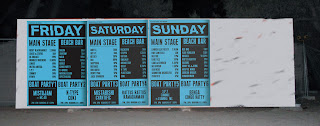
Again showing the context for the 'poster programme'. Different shots and angles of the wall below, also showing interacton with people in front, chatting etc.
Now onto the designs....
As I've previously explained the programme will be in the form of 4 large posters. (Of which will be made of 4 posters each) These four sections have been broken down into, Friday, Saturday, Sunday, and a final one for logos and resort area map.
Thats the format of it, the design was fairly straight forward, keeping in line with my previous designs for Decoy. Keeping a fairly cliche / appropriate style for them. I doubt this is something that would need a lot of tweeking.
In line with this I would love to print these onto fluro stock, whether it be a blue, or the basic green / yellow fluro. If not I think a cool blue like this suits. Keeps it bright and appealing without hurting the eyes, making it hard to read / busy.
I still need to complete the design for the 4th section poster, this will be coming shortly. For now I quickly mocked the posters up on the photos of the wall. Giving us a better sense of the actual size they will be and sit on the surface.


No comments:
Post a Comment