
Showing posts with label Brief Five: End of Year Show. Show all posts
Showing posts with label Brief Five: End of Year Show. Show all posts
Friday, 3 June 2011

Monday, 21 March 2011
Sunday, 20 March 2011
Range and Deliverables
Invites in the form of shopping lists. Using the same handwritten typeface as on the Tagline logo / signs / poster. Colour scheme throughout.

Signage around Uni, taken from poster imagery...


And the branded shopping bag.

Poster
Had some initial thoughts for the poster, using standard colour systems, red / yellow making it very cliche. But everything I did with this theme just looked shit. I don't mind shit for a reason, but I just thought I could better it.
The poster imagery for me would sell the whole concept, so it needed to be spot on.
I then, on a spontaneous urge decided to make these blue classic shaped signs.
The photograph them, creating a basis for the poster. Creating a sense of depth and reality.
Tried a few ways of photographing them, the best being put on small stands, higher and lower than each other, creating a field of depth, layers etc.


Then taking the preferred composition of the signs, adding cliché stereotypical food promo language....
Adding logo and basic information,
With offers on.... (Insert each course)

Giving it more impact with a specific colour scheme, to run through the whole range and deliverables. A take on the classic red and yellow scheme for most supermarket signage.

Logo Design & Tagline / Exhibition Title
So what could the name / logo be for LCA Supermarket, does it a need a new logo completely? Do we have to use the existing one?
It turned out, yes. Well the existing logo had to be included. So why not add / update it to fit in as a supermarket logo?
What about the slogan!?
I documented all the existing supermarket taglines, and using the given concept words / themes tried to make a new adapted tagline.
Fresh Creatives for you.
A take on, Fresh food for you, Morrisons.
This then became Quality Creatives for you. Using two of the theme words. High Quality and Creative.
Ripping off Tesco and sainsburys, with their hand written typeface for the tagline, making it much more personal, user friendly and familiar.
Also tried a more M&S, Waitrose vibe with Helvetica Light / thin.


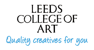


In the end going for this as the logo and exhibition name.
Leeds College of Art, Quality Creatives for you.

It turned out, yes. Well the existing logo had to be included. So why not add / update it to fit in as a supermarket logo?
What about the slogan!?
I documented all the existing supermarket taglines, and using the given concept words / themes tried to make a new adapted tagline.
Fresh Creatives for you.
A take on, Fresh food for you, Morrisons.
This then became Quality Creatives for you. Using two of the theme words. High Quality and Creative.
Ripping off Tesco and sainsburys, with their hand written typeface for the tagline, making it much more personal, user friendly and familiar.
Also tried a more M&S, Waitrose vibe with Helvetica Light / thin.


Leeds College of Art, Quality Creatives for you.

Inspiration and Imagery
In my head i had specific visuals to represent what could be done, the possibilities for ranges, and how this could look in terms of designs.
Shopping bags, this being something I thought could be of great use. Excellent means of branding to fulfill supermarket image. Plus a carrier for all our yearbooks.
Also Cliche imagery, signs, like hakf price / todays special etc! Stereotypical langauge used in these kind of promotion / sale like signs.


Shopping trolleys / baskets, these kind of things could be possible installation pieces!
Shopping lists for invites?
Recipts / signage.
An important aspect of this concept is to make up a logo / title for LCA Supermarket. As well as the tagline. This being a possible name for the exhibition itself.

Shopping bags, this being something I thought could be of great use. Excellent means of branding to fulfill supermarket image. Plus a carrier for all our yearbooks.
Also Cliche imagery, signs, like hakf price / todays special etc! Stereotypical langauge used in these kind of promotion / sale like signs.


Shopping trolleys / baskets, these kind of things could be possible installation pieces!
Shopping lists for invites?
Recipts / signage.
An important aspect of this concept is to make up a logo / title for LCA Supermarket. As well as the tagline. This being a possible name for the exhibition itself.

Concept
I wanted to come up with a friendly, bright, happy, inviting theme / concept for my proposal.
Using the concept words in the brief, Creative, Innovative, High Quality and Specialist and the mixing it with the idea of us being fresh, new graduates I came to what I felt a strong overarching concept.
As we are new graduates and are offering our skills to the public, etc. We are somewhat comparable to products, things on sale. Or if you will, Fresh Produce.
So, I proposed to make LCA into a creative supermarket.
With the finest offers on art and design graduates.
Using the concept words in the brief, Creative, Innovative, High Quality and Specialist and the mixing it with the idea of us being fresh, new graduates I came to what I felt a strong overarching concept.
As we are new graduates and are offering our skills to the public, etc. We are somewhat comparable to products, things on sale. Or if you will, Fresh Produce.
So, I proposed to make LCA into a creative supermarket.
With the finest offers on art and design graduates.
Subscribe to:
Posts (Atom)