Sidewalk, one of the biggest international skateboarding magazines out there, been going a long time.
Analysis & findings...

Documentation...
Glossy cover, free stickers, busy, bright...

Bold, sans serif typeface, similar to Impact,


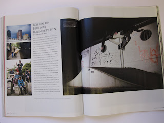
Interesting to see the diversity in layouts and colour used. As well as variation in used typefaces and sizes of. Mostly a busy magazine a lot of things going on throughout, busy photography due to the urban environment, this then emphasised with quite a healthy amount of copy and extra imagery / design.
Scrab-book like. Not too bothered on aesthetics / clean imagery.
Street art inspired? The layering and placement of things resembles this I feel.
Also an interesting point to the mag is that it has an abundance of shop and product adverts, a lot of selling to the reader.

 Double Page spreads...


No comments:
Post a Comment