Friday 28 January 2011
Thursday 27 January 2011
Brief One: Initial ideas
 Here is just a quick mock up of the kind of style I had in mind, fluorescent, in your face colour with the slogan, and Nike logo (to be changed to Nike 6.0). The only problem with using Nike is that I think a few boarders of all areas will be a bit hesitant to buy Nike goods, due to its big corporate connotations and affiliations with mainstream culture. Personally I dont feel like this, but I did when Nike first stepped out into snowboarding, so it may be an issue of getting an immediate response from the TA to buy into it. For some reason the design above reminds me of golf. I've no idea why.
Brief One: Initial ideas
As my main theme is based around identity and subcultures I thought of a way of showing this via the board artwork. Although within the different areas of board cultures there are similarities there are also a lot of differences between the kind of people that make up these cultures. One thing that involves both differences and similarities is language and the slang used within the cultures. So making use of this and the stereotypical image of the people doing these sports being really cool 'dudes' I've made statements to be put on the appropriate board.
A good stereotypical image of a boarder, I think, is Spicoli, from the film, Fast times at Richmont High...
Note the use of the words, Dude, Awesome & Gnarly.
So these are the statements I could think of using, some being more appropriate for certain ones...

(Not just for Wakeboarders, showing the sentence and different endings)
Again being that the brief is for Nike, I've used Futura STD Bold Oblique making it look somewhat like Nike...
Taking the piss a bit, but I think they would work well on boards as just a bit of a laugh. Making a statement, of who gives a fuck!?
Brief One: Stats
Just an interesting bit of stats that relates specifically to wakeboarding but relevant to all board cultures...
"In the same way that snowboarding has brought about a cultural revolution in the ski market, wakeboarding has reinvented water-skiing. Wakeboarding is the fastest growing watersport in the world and now has over 3 million participants worldwide. 63% of these participants are under the age of 24. Along with the three million plus wakeboarders worldwide there is now a growing faction of wakeskate enthusiasts. When included in the wakeboard figures you have a community of boardsports enthusiasts who outnumber surfers by more than two to one. "
Interesting to see the comparison of wake-boarders to surfers. I would imagine that the surfing community is larger overall if the 'enthusiasts' are included but interesting to see wakeboarding beeing deemed a more popular sport / hobbie than surfing.
I think its an interesting concept to play with is the relations between boarders, could represent it like gangs. Each set thinking there a little bit cooler than all the others.
Brief Four
Initial design ideas for the Epithiny logo.
Found myself being about as creative as a dead crab. That is to say, not very. Nonetheless It's a start...


I think the problem was trying to incorporate the eye into the design. But the letter, 'e' should be easy to turn into an eye, more work needed on that alone.
Brief Five:
What Can It Be?
Although my main intentions for this brief is to create a body of decent illustrative / type based work I want to be able to propose a function for them, so to show that there not just pretty pictures or whatever.
So what could they become or be part off...
. Single artwork
They could easily be transferred to single cd artwork and the digital equivalent on the Itunes store.
. Basis to album artwork, could be used as a style to then create the whole albums artwork, front cover, CD print and inserts etc.
. Promotional posters or flyers for the single
. Used for Digital banners
. T-Shirt designs & general merchandise,
Brief Five
Looking at different styles and aspects of illustration.
Keeping this strong focus on type throughout, what I intend to get from this brief is a body of diverse typographic designs some of which will be illustration based.
These being a few styles and examples I like and showing the quality of work I aim to achieve...
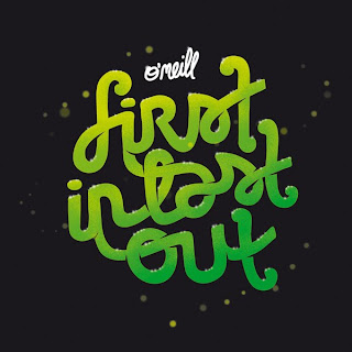
Some more Nike designs...

 Quite hard to read but I feel that this is not really a bad thing as I personally just stare at it for ages until I know what it says, so in a way it causes people to really look at it. This being one reason why my illustrations need to be of a good quality.
 Some character based Nike illustrations...
Examples if size and range with the same illustration (style)
From the small, Iphone case / digital wallpaper to a huge wall painting in an urban environment.
Some beautiful designs from Sebastien Cuypers, this digital, 3D style is something I also want to expand into, developing my skills using software and graphics tablet, carrying on from where I finished last module.
Brief Four
Some initial imagery and research for both of the branding projects...
Firstly Epithiny, essentially this is his visual identity...
Botz Brigade...
These are images I've been sent from the client of logos he likes and the kind of style he is looking for.


 Simple black logos, maybe using negative space etc, Although a fairly simple task it's quite hard to produce something that minimal that I feel works and I'm happy with. A work in progress.


 Simple black logos, maybe using negative space etc, Although a fairly simple task it's quite hard to produce something that minimal that I feel works and I'm happy with. A work in progress.
Thought I'd post this as a strong branding project, food for thought on if I will extend the two projects to end up with a body of work similar to this...


 Relevant to these two briefs as it is all kept black and white colour scheme. Showing that you don't need colour to make something interesting and appealing even through a strong range, it doesn't get boring or lose anything.
 Brief Three
For this brief I intend to produce something completely new, of which the original product isn;t something that is highly documented. Snowboard packaging / labelling is something that I dont think is hugely thought about, thus there is room for someone to produce something that could become the new universal standard packaging / label for snowboards.
All I have at the moment in terms of what exists atm is the designs I did last module.


These being stickers that would go either on the base or top of the snowboard in-stores. Giving the name and information of the board, its size, show the logos and any slogans.
Brief Two
My research for this brief will mostly be looking at branding and visual identity of music festivals, obviously looking at Soundwave but also other European festivals, such as Creamfields, Global Gathering, Reading / leeds festival etc
Firstly, Soundwave...
Original logo...
 New logo...
Then that taken across the range of promotional material, flyers & posters as well as the programmes / wristbands / tickets (Photos of to come soon)

 The monotone works very well and if anything brings the type out more, keeping it perfectly legible & making it inviting to read. Catches the eye and all that jazz.
 Urban Nerds...
Events / club night company, I've posted on these guys before but in my opinion they produce and release the best promo flyers around,


Another eastern European festival, Exit. Drum & Bass, quite a hefty weekend so I'm told. Love this simple, bold design. Think a mixture of this with the monotone and imagery of soundwave could produce a quality bit of work.
 Creamfields, good looking piece of design, however I'm not sure of what format this actually takes, it could be a bit busy if it's on a small format.
 Bit more of a decorative style of promo...
Colours work but not sure on the type, again would be much better If i could see it printed and on the right stock / format.
Subscribe to:
Posts (Atom)


 & Set times / programme

