Wednesday 30 March 2011

Final April Flyer

Final designs here. The front taking the template from the first, logos and date bottom left. This time there are more / bigger logos so it has taken up the full width of the flyer. The general principle of the front will be a different application of the Decoy full logo. 


April Flyer Brief & Development

Got sent the details for the next Decoy club-night, and again was very much a quick turn-around. It needed to be done in a day . 

Easy Brother,

Hope your well and Dandy mate.

Details for next event are as follows:

Dice Records presents DECOY.
13/04/11
@ Distrikt
7 Duncan Street
Leeds LS1 6DQ
10pm - 2pm
FREE ENTRY

Line Up:

Kotez (Eight:FX)
Muttley (Dice/Decoy)
Pasteman (Cut&Paste/Bashout)
Tigger (Decoy)
Jamie Barber (Decoy)
J.Mowgli (Dice/Decoy)

Think thats everything you need to know. Il send you another email with the logos i need you to include on the flyer/design.
Because this email keeps messing up when uploading attachments. 

Safety!

x


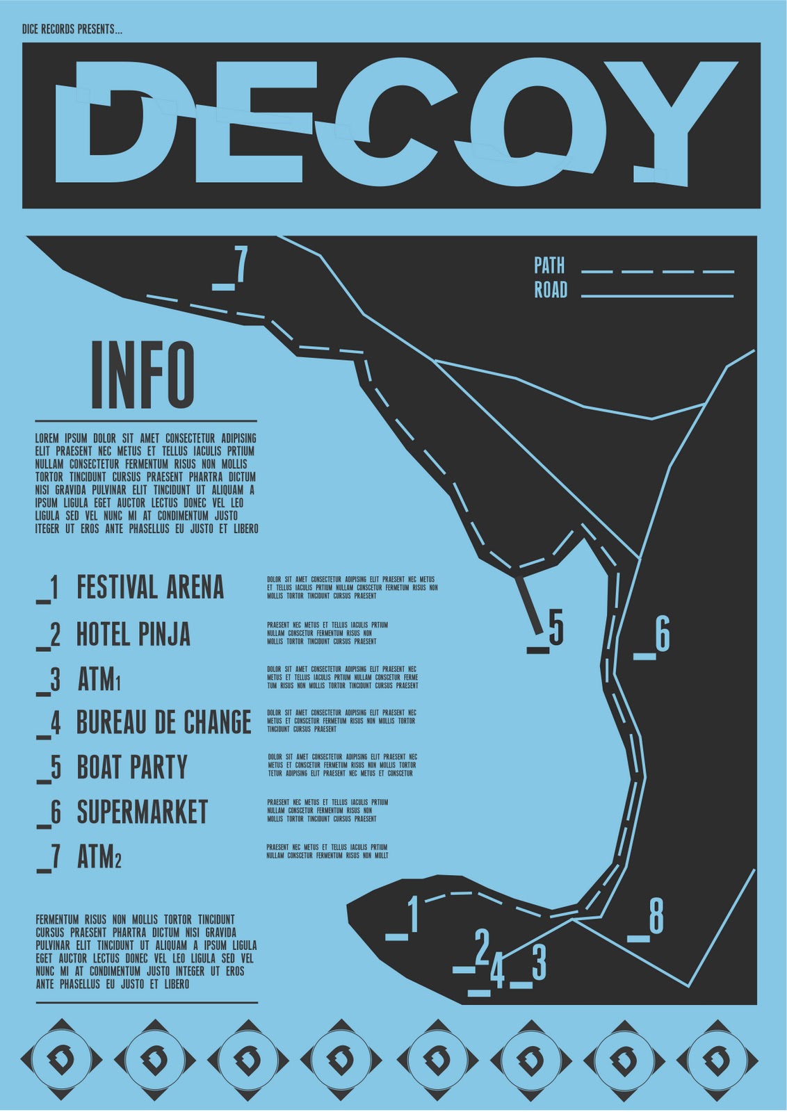
Had a quick chat with the client and they asked specifically for an 'electric blue' this time round, this being a slight coincidence as it being the colour I've been using for the festival visuals. Therefore the colour used for the festival designs may change from this point forward. 
Design process and development...


Took some time trying to make everything look even. Including the date, location, time, drinks offer, logos etc
Considering the time limit I wasn't able to really experiment with the looks of the flyer. Going with simply what came to mind, the main focus being to keep it in the same style as the first flyer yet making it a little different and visually interesting.
The front of the flyer is to do.

Tuesday 29 March 2011

Packaging for Programme Poster?

?

Promo Poster

Finalised design...


Included everything that I had planned to and deemed necessary. Including logos for Dice Records, Decoy and Don't Panic. Preview of the line up, details of artists / stages / boat etc!


Context for poster.
These boxes are the ideal situation for them. Along with similar other posters, music, club-night and festival promotions! 


Promo Poster Development

With the programme designs done needed to move on with the rest of the set deliverables. 
First to do, half of the print based promotion for the festival. 
A0 Poster. 
Planning for content and design, obviously it has to sit with the style of the programme designs so that is somewhat decided. The content however is still up in the air. 
Thinking below...


content:
Logo / header
Date
Location
Ticket Info
Line up
Boat party
Further information

This is what I think needs to go on the poster, taken from research and looking into existing festival promotional material. 

Design process...


Following the same style I put forward for the programme, finding ways to include all the information above.

Sunday 27 March 2011

Colour change

All the groups were called together to have a quick 'crisis' chat regarding budget. Apparently most groups had gone way over budget and needed to go back and get rid of a load of costs, this also affected us as we were wrong in thinking the amount that we had.
So as a group we went away, got in touch with Clive and found out where our costs were going. A lot of which were down on the spot orange colour. Now the colour wasn't a necessary attribute of the yearbook, I merely put it forward due to its positive connotations and the quality of the colour when printed with a spot.
This really wasn't enough reasoning for us to keep it though and as a group decided to drop it for something that Marc had tried and put forward by designing some of the proposal designs in cyan. They looked quality and thankfully you can get a strong vibrant cyan from the 4 colour process printing.

So we are now settled on the colour scheme of cyan black and white.

Friday 25 March 2011

Contextualisation Wall Programme Posters


Full design of wall posters mocked up. Keeping the wall graffitied adds more to it i think. Grabs and keeps the eye more focused than if it was just white. Furthermore suits the style and urban connotations of the programme design.

Contextualisation A2 Programme Poster


The intended context for the product, bedroom wall, after being bought from the festival as merchandise / memorabilia.

Thursday 24 March 2011

A2 Programme Poster

As part of my deliverables I have taken the designs of the 4 part wall programme and made an A2 sized poster, which would be on sale along with the other merchandise (to come) as a souvenir / programme / poster. Something for people to take home, stick on their wall and remember what a jolly good time they had!


Crit Session 24/03/11

Crit went fairly well, no real big problems.
Few things to take forward and respond to though...


. Blog
In terms of my blog, I've been told to add the brief titles to the labels, making it more clear and memorable when sifting through everything.
There was concern when the two sets of pairs got confused a little with what I was doing with my significant briefs. Brief One - Nike IDB, it was said that they weren't sure exactly what I was doing with the brief, and they thought it was all just research. Which it isn't but because of it being conceptually based and research driven it looks that way. Need to label my own designs better maybe? As I am designing something in accordance with the existing website.
There was also confusion with Brief Two - Decoy. This being simply due to 2 briefs becoming one. Need to make this more apparent and obvious.

Advised to blog a post on the briefs I will actually be working on till the end.

. Briefs
In terms of the briefs themselves, I was given good, positive feedback. Some advice given on changing my poster / programme designs around a little, moving some bits here and there.
They seemed to think I've done a lot of work, wheras I fell as though I haven't, so thats a bonus.

Wednesday 23 March 2011

4 Part Programme Poster

Map


Promo Context 4

Another promotional leaflet for a UK festival, this one being a bit more alternative / electro.
Similar to the global gathering, big more informal. Holds basic info, and necessary stuff on the line up. Again makes a strong poster either side. This being a big focus on the design, I would have thought.


Promo Context 3

This is a promo triple gate fold flyer for a new set of clubs / bars in Birmingham, after going a rebrand and all that.


The rebrand itself is really good, strong logos, contemporary, fresh and act well as a set. The flyer itself is quite large for the job its doing, but I like it nonetheless. Specifically just really like the fold out process, reminds me of my designs for the wall programme. This could work really well if it was a bit smaller, and 4 part fold out, representing the wall programme design.

Promo Context 2

This is another promo flyer, this time for Global Gathering. Again another dance festival in the UK. Creamfields rival if you will.
I much prefer this to the Creamfields. It acts as a fine point of promotion, having necessary information, but unlike the Cream one, this makes a good poster, with the mini line up poster on the reverse of it.


Strong imagery, different to cream as is an image based poster. Although I am type lead I much prefer this one. Purely for the multi job its doing, poster and leaflet.

Promo Context 1

This is a promotional leaflet for CreamFields, UK Dance festival.
Designed by Corporation Pop, pretty cool design studio in Manchester. A3 Fold out, lot of information. Shown in a bright vibrant way, still easy to read. Give all necessary promotional information. Line up, tickets, camping info etc! Slight complicated fold, hard to get it back the right way in one go.


Folds out to a poster, but doesn't look like something I'd personally stick on my wall. Strong use of colour though, 4 colour process, still got some bright vibrant colours going on.